Here i attempted to create abstract images on a larger scale, this piece is around 75cm in width. However I am very unhappy, as I feel it looks much too graphic. Also I did not use a larger brush - I find when working smaller it is easier for just one small brush mark to have an impact, whereas on a larger scale you have to work to create such spontaneity. For this reason I will probably work on a series of smaller paintings in series. I have done 9, also photographed below.
And my 9 pieces. I need to choose my favourite, or display them 3 by 3. For me, this project largely became about the process, and so these 9 have helped develop my process, each one bringing something new.
Rosie Minney, 21 year old art student at Newcastle University. Former student at the Royal Drawing School. Writer for Corridor8. rosie.minney@btinternet.com @rosieminneyart
Thursday, May 19, 2016
some sketchbook studies
Just some work from sketchbooks. Various media, charcoal, oils, acrylic, fine liner, stitch, collage. Sizes between A4 and A5.
![]() |
| my palette |
Thursday, April 21, 2016
a new project - exploring the urban jungle
I decided to use a mixture of media to kick start my new project. I began by tirelessly snapping photographs of parts of London, particularly more "gritty" areas: e.g. neon signs, rubbish bins, kebab shops etc
I collaged them all together, creating my own fictional panorama, which lends itself to further paintings being created.
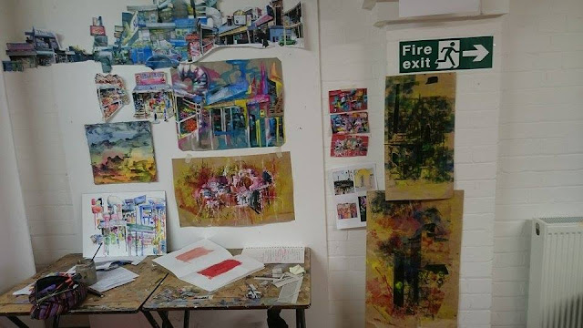
I knew I wanted to incorporate paint, and used photographs to collage as a way of exploring typography as well.
I collaged them all together, creating my own fictional panorama, which lends itself to further paintings being created.
![]() |
| my workspace: the long panoramic collage can be seen running across the top left of the photograph |
![]() |
| pencil, charcoal, photographs, watered down acrylic. Canvas, around A3 size |
![]() |
| oil paint on top. I fancy the idea of using stitch to further outline the buildings; add definition. |
![]() |
| pencil and watercolour on board, a study from my collage. Around A3 size |
It's always ironic when the small, experimental studies turn out to be the ones you like most! Using an old scrap of a window blind found in a skip, I cut small rectangles (around A5) and used a mixture of newspaper, acrylic, oil and charcoal to create these abstract pieces. They were hugely inspired by Robert Rauschenberg's Combines. I intend on making these much larger - I particularly love the earthy red background, which makes the piece feel a lot more complete than just a sterile white. The colours also bounce brilliantly off the fabric.
![]() |
| I feel these little experiments perfectly capture not necessarily the 'look' but the 'feel' of being in a bustling city |
Below I experimented using some old brown wrapping paper, printmaking inks in pink, yellow, blue and black, some black tape (which I wanted to emulate the strong, straight verticals in architecture), upon which I monoprinted. The colours were chosen to show the gritty darkness of a city, with the bright colours being the neon signs of chicken shops that I have been looking at. However, I feel they are quite uncontrolled, and thus not my favourite pieces.
This was created on brown paper, pink and yellow printmaking ink rolled on, and then I used watery white acrylic to provide a ground. This paint mixed nicely with the ink making various tones of pink across the page. I incorporated photography to link it strongly back to my project, and then monoprinted on top. I feel it still looks a little flat - perhaps include stitch?? Or impasto oil paint.
Sunday, April 3, 2016
Friday, January 29, 2016
mixed media experiments
Recently I have been absorbed in experimenting with media
![]() |
| here i experimented with an acrylic ground, and applying watercolour and bleach. On the left I painted on plastic, cardboard on the right |
![]() |
| a watercolour painting on the left depicting clouds; on the right I used a water wash and dropped ink onto the water using a pipette, letting the colour seep naturally |
![]() |
| A carborundum print. I glued plastic bags, carborundum powder in fine and rough and crumpled paper, applied varnish and printed it using a printing press |
![]() |
| another carborundum board and print |
![]() |
| two carborundum prints |
| details from an experimental piece: textured paste, ripped paper, acrylic paint, watercolour paint and bleach on cardboard |
Friday, December 18, 2015
Moving from sculpture to abstract painting
From my photographs of my sculpture, I inputed them on Photoshop and, after a lot of fiddling about, managed to use the "invert" tool and adjust the colour balance to create some very interesting imagery. The more obscure the picture, the more drawn I was to it.
My workspace, including two other pieces in white spirit and oil paint, carried out on canvas.
From these, came a series of abstract paintings. To create these, I used a mixture of oil paint, methylated spirits and white spirit.
![]() |
| white spirit, oil paint on canvas. |
![]() |
| white spirit, methylated spirits, oil paint on primed paper (gives a more vibrant richness to the paints) |
![]() |
oil paint and white spirit on primed paper
![]() |
| white spirit, methylated spirits and oil paint on primed paper |
![]() |
My workspace, including two other pieces in white spirit and oil paint, carried out on canvas.
Subscribe to:
Posts (Atom)


