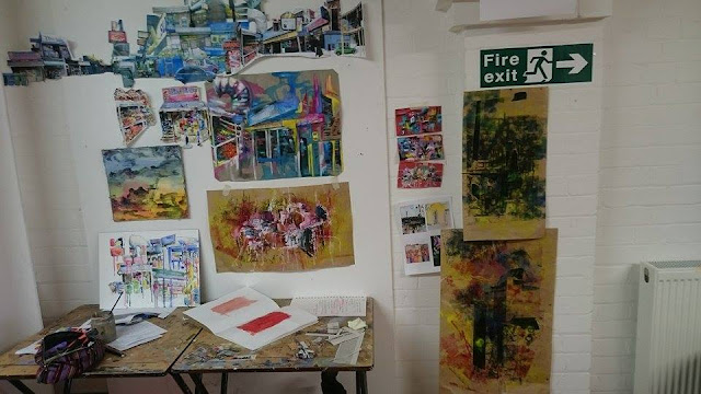
I decided to use a mixture of media to kick start my new project. I began by tirelessly snapping photographs of parts of London, particularly more "gritty" areas: e.g. neon signs, rubbish bins, kebab shops etc
I collaged them all together, creating my own fictional panorama, which lends itself to further paintings being created.
 |
| my workspace: the long panoramic collage can be seen running across the top left of the photograph |
I knew I wanted to incorporate paint, and used photographs to collage as a way of exploring typography as well.
 |
| pencil, charcoal, photographs, watered down acrylic. Canvas, around A3 size |
 |
| oil paint on top. I fancy the idea of using stitch to further outline the buildings; add definition. |
 |
| pencil and watercolour on board, a study from my collage. Around A3 size |
It's always ironic when the small, experimental studies turn out to be the ones you like most! Using an old scrap of a window blind found in a skip, I cut small rectangles (around A5) and used a mixture of newspaper, acrylic, oil and charcoal to create these abstract pieces. They were hugely inspired by Robert Rauschenberg's Combines. I intend on making these much larger - I particularly love the earthy red background, which makes the piece feel a lot more complete than just a sterile white. The colours also bounce brilliantly off the fabric.
 |
| I feel these little experiments perfectly capture not necessarily the 'look' but the 'feel' of being in a bustling city |
Below I experimented using some old brown wrapping paper, printmaking inks in pink, yellow, blue and black, some black tape (which I wanted to emulate the strong, straight verticals in architecture), upon which I monoprinted. The colours were chosen to show the gritty darkness of a city, with the bright colours being the neon signs of chicken shops that I have been looking at. However, I feel they are quite uncontrolled, and thus not my favourite pieces.
This was created on brown paper, pink and yellow printmaking ink rolled on, and then I used watery white acrylic to provide a ground. This paint mixed nicely with the ink making various tones of pink across the page. I incorporated photography to link it strongly back to my project, and then monoprinted on top. I feel it still looks a little flat - perhaps include stitch?? Or impasto oil paint.


