Monday, December 4, 2017

In My Room II - chromatic greys/figurative exploration

Using a red ground, I experimented with chromatic greys again on A1 paper in oil. Wanting to make the colours play off each other without characteristically getting too gaudy and colourful, I stuck to colour theory, using only lemon yellow, cadmium red, cobalt blue and titanium white to conjure up tonal greys, hinting with green to offset the complimentary red background.
I'm hoping to study more colour theory and work on my complimentary colours, alternating ground colours and working towards a comprehensive understanding of colour so as to not get too trigger happy with my permanent rose (guilty!)
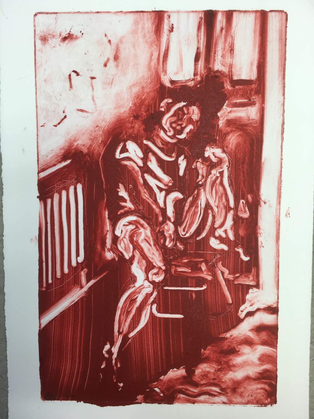
Working at confidently placing the figure in space is also prominent in my practice, instead of rigidly sitting within a graphite underdrawing, I have painted and rubbed away painted outlines so as to build a depth to the composition and freely building an environment within which my figure can sit.
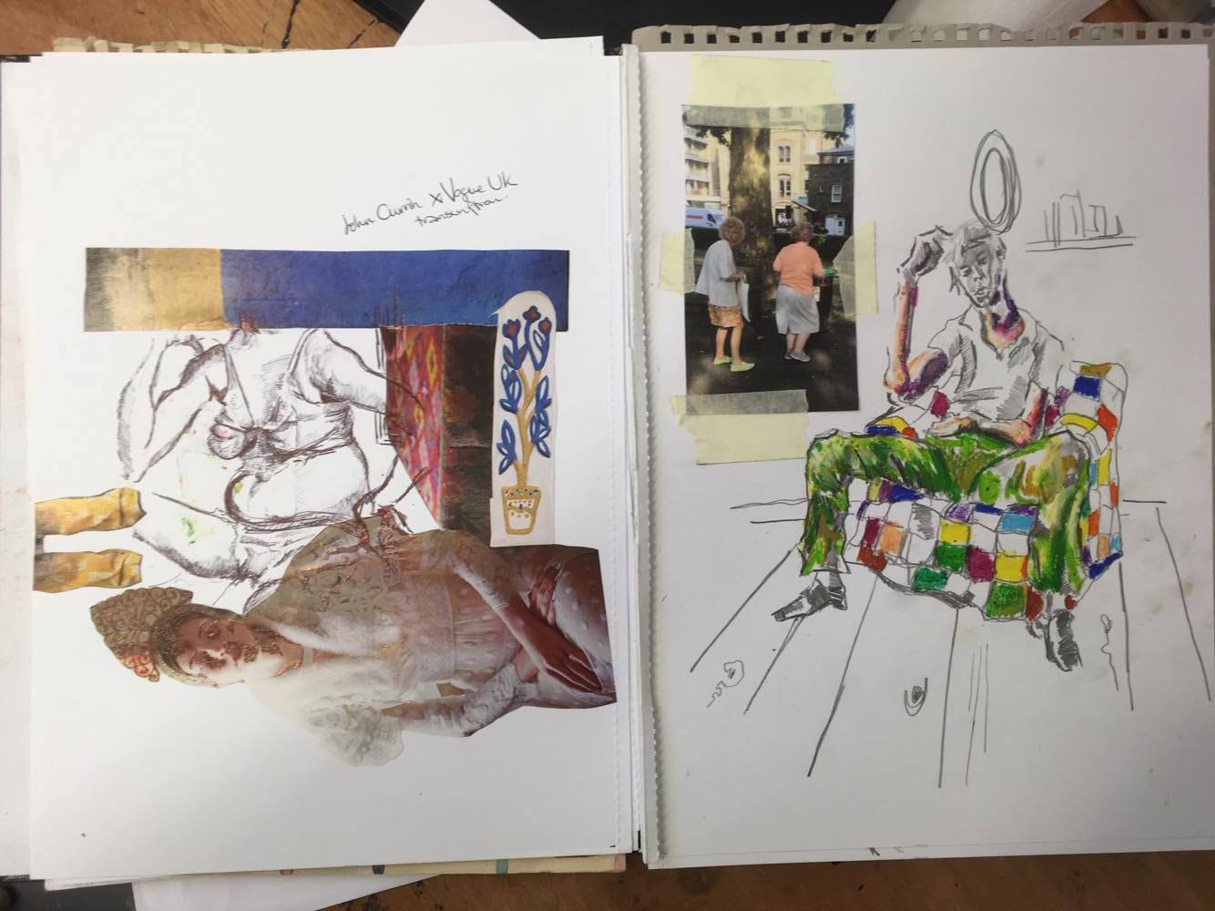
Influences: Lucian Freud, Francis Bacon, Paula Rego, Marlene Dumas.


Venture into sculpture

Having studied to an extent the biomorphism of Henry Moore, I was inspired to work from the amorphous forms in my printmaking to create these quick visceral abstract maquettes. Whilst not my favourite works, they stand at maximum 30cm high and add an interesting 3 dimensional aspect to my body of work this term.


preparatory sketches working loosely from the forms in my printmaking 


the internal structures are built from tinfoil and trusty papier mache


I covered the sculptures in magazine clippings, chosen carefully for their visceral colours, and abstracted further by vigorously brushing with white spirit


Debauchery

In this 100cm x 110cm oil painting on canvas, I worked from a fleeting photograph taken at my 21st birthday party. Wanting to depict my celebrations with my closest friend, the painting immortalises a moment I personally will never remember. I could say that I made this painting in anticipated nostalgia and sentimentality more so than anything else.
That said, my main influences were Lucian Freud and Marlene Dumas.


Details


My studio


Friday, November 24, 2017

In My Room

A large departure from my usual colourful - bordering on acidic - palette, I have been working with just lemon yellow, cobalt blue and cadmium red with white to work with a chromatic grey scale. My monochromatic works such as my charcoal drawing and printmaking have most believably captured my subject, thus working from chromatic greys and focusing mainly on tone seems to be a wise way to develop my painting.
Main influences: Lucian Freud, Marlene Dumas and Francis Bacon.


oil paint on A1 primed paper


details - i love how just the simplest marks can form the human body. Often leaving areas blank (such as the toes here) is actually more effective


Preparatory print-making

Working from a few snapshots, I decided to work from a limited palette - incredibly limited at just one colour! I want to work on improving my eye for tone.
Here are 4 monoprints on around A5 paper, looking at partially abstracting forms as well as singling out tone, whilst placing the figure believably in space.
I really enjoyed creating an atmospheric setting - I rolled ink onto copper plates, then rubbed and swiped away from tissue paper, pencils and cotton buds. I love some of the mark making debris left on the white patches.
The first two were done simply in ruby red etching ink, whilst the latter two are a mixture of red and yellow ochre to turn down the brightness.

Katie
Daddy

In my Room

In my Room II


feedback - working from observation

Following feedback from my tutor, he informed me that whilst my previous drawing was well realised, I would benefit from observational studies. This is difficult seeing as the majority of life classes require payment and most people are not willing to sit for a portrait. 

Here is a quick 15 minute painting I did of a studio mate before she decided to move.
Make your judgement - I hate it.


A5 preparatory graphite sketch

approx A2 canvas. Yellow oil paint on pink ground


detail


Friday, October 27, 2017

The Boys - large charcoal drawing

Inspired recently by Caravaggio, I took a photo on a whim of my brother and father in a darkened room and the flash illuminated the figures in a way which closely mimics the chiaroscuro of Caravaggio (although obviously nowhere near as good.) I decided to make a monochrome drawing, adding paper as I needed.

Graphite and charcoal on paper, approx 115cm x 100cm


Friday, October 20, 2017

Corridor8 art reviews

Seeing as I am interested in pursuing a career in art critiquing for a magazine or online, I got involved in an art platform called Corridor8 which focuses on visual arts and writing in the north of England, which is perfect since I live and study in Newcastle!
Here are links to two reviews I have written so far this year.


Wednesday, October 18, 2017

summer sketchbook

I thought I would share some of my summer sketchbook work which I am using for this years project, where I will be looking at the human figure, portraiture, and people in places.


(left) collage and biro drawing, A4 (right) photograph, pencil and oil pastel drawing A4

(left) pencil and coloured pencil drawing A4 (right) finaliser drawing with sandwich bag collage, A4

pencil and coloured pencil drawings, all A4

(left) newspaper and biro drawing A4 (right) coloured pencil drawing A4

(left) fine liner drawing A5 (right) pencil and coloured pencil drawing A5

(left) David Hockney postcards (right) pencil drawings A4

(left) biro and chalk pastel drawing A4 (right) coloured pencil and oil pastel drawings A4

after Matisse, pencil, pastel and biro doodles, collage. Both A4

graphite and highlighter sketch, A5

(left) collage A4 (right) graphite sketch A4

(left) fine liner sketch A5 (right) pencil sketch A5

both pencil drawings A4

(left) pencil sketches A4 (right) charcoal and coloured pencil drawing A4

pencil life sketches both A5